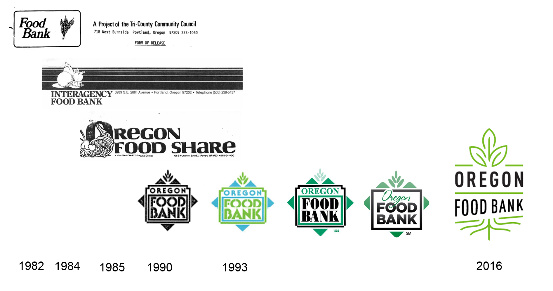
A new look – Oregon Food Bank introduces a revitalized brand
A new look – Oregon Food Bank introduces a revitalized brand
August 18, 2016 – “To eliminate hunger and its root causes … because no one should be hungry.” Oregon Food Bank fully embraces our mission statement and we are dedicated to ensuring no one goes hungry today, that Oregon becomes the first state to eliminate hunger, and that we hold people experiencing hunger at the center of all we do.
The way we appear in the community – our visuals, our language – needs to better reflect and communicate this commitment. Oregon Food Bank’s new look is fresh, like the Oregon-grown produce we are so proud to distribute. It is bold, like our vision for a hunger-free Oregon. It is warm, like the human connection and community we so value. It respects our past while looking to the future.
You will see the new look in our updated logo, on our trucks and website, and in our publications. We were humbled to have probono expertise from award-winning design firm Industry and experts at Nike to guide us, so that we can communicate our work effectively through this new look with a bare minimum of expense. Truly, it takes a community!
Our logo, a reflection of who we are
Creating a new logo that represents all facets of Oregon Food Bank was a deliberate, thoughtful process.
The simple, modern design communicates Oregon Food Bank’s mission and work. The leaves represent an increasing emphasis on fresh food and nutrition, as well as our connection to Oregon’s agriculture community. Slanted lines under the text indicate Oregon Food Bank’s movement towards a hunger-free future. The roots stand for our root cause work, which includes shaping public policy, building community and amplifying the voices of people facing hunger.

